Lillie O’Brien & The London Borough of Jam
The loganberry jam that Lillie O’Brien and I made will be available exclusively at The Artists of Spitalfields Life opening at Ben Pentreath Ltd tonight.

Lillie O’Brien among the loganberries
As you can see, Lillie O’Brien sole trader of the London Borough of Jam has a passion for loganberries, that curious nineteenth century hybrid of the raspberry and the blackberry which possesses its own piquant flavour quite distinct from its cultivars – tart and pungent and tangy. Lillie has devoted herself to earning a living by making jam in small batches from fresh fruit as it comes into season and last summer she became captivated by the irresistible notion of loganberry jam.
The loganberries season only lasts two weeks and, when Lillie contacted Covent Garden Market, she discovered that none were to be found. There is no demand for loganberries, she was told. Yet the scarcity only sharpened Lillie’s resolve, recognising that if she found some, she could corner the market in loganberry jam for the whole of London. Many phone calls later, Lillie spoke with a fruit farmer in Kent who had just one line of loganberry plants, ready to pick. Having located the elusive berries, Lillie just needed some assistance with the picking, which was how I became her accomplice in the quest for this rare fruit.
After a week of floods, we expected the weather to be against us but yesterday morning dawned dry and sunny after the night of heavy rain, filling us with hope as we set out from East London towards Kent with buckets and pots in hand. Trudging through fields of strawberries, passing raspberries and blackberries, we came to the loganberries trained upon wires – since, in its trailing form, the plant bears a closer resemblance to the blackberry, even if the individual fruits look like extended raspberries. Once we arrived, Lillie clasped her hands and gasped in delight to set her eyes upon the object of her quest. We were not disappointed.
In fact, we found ourselves doubly the beneficiaries of this respite in the weather, because no-one else had been there to pick for several days and the plants were heavy with fruit, many turning the deep pink with a tinge of blue that is the sign of the ripe loganberry. Working on either side of the line, Lillie and I picked our way along systematically, working without a break and gathering over twenty kilos in just a few hours, stripping the plants of ripe fruit. The berries were sweet and aromatic, and soon our fingers were stained purple. For a couple of hours, we had the privilege to enjoy a blue sky and racing clouds for our loganberry picking, which could not have happened if the fruit were wet.
Yet by the time we reached London in the early afternoon, the clouds had already covered the sky again and the first raindrops were falling, which served to emphasise how lucky we were to have gathered our precious haul. As soon as we had carried the fruit into Lillie’s kitchen in Hackney, she filled her copper jam pan with two kilogrammes of loganberries and set straight to work, making jam to capture the flavour of the fruit within hours of picking it in the field. Once the berries in the pan upon the stove had broken down, Lillie added the sugar and tested the syrupy mixture constantly with her wooden spoon, to ensure that the consistency of the jam was satisfactory and avoid any overcooking of the fruit which would impair the flavour.
Within an hour, we had eight jars of loganberry jam, glowing a rich pink upon the table. It marked the proud achievement of our quest. Afterwards, I walked back through the driving rain in the premature dusk to Spitalfields and, once I arrived home, I took a spoon and sat alone in my living room with my jar of jam. Already it had set to a gelatinous consistency, and I ate a spoonful direct from the pot. At once, I was transported back to my few hours in the sun picking berries. There was a delicate natural sweetness to this jam that was not at all sugary, an intense fruit flavour with a flowery perfume and a delicious tang of citrus. Let me confess, I ate another spoonful of jam, and then, in the half light, I sat and contemplated the aftertaste of loganberries.
I had left Lillie completely absorbed in her task of making jam from all the loganberries we had picked. It may take her all day on Friday to complete the estimated batch of eighty jars of jam that our crop of berries should produce. You can buy your own pot of this rare preserve to enjoy for yourself, exclusively from The Artists of Spitalfields Life at Ben PentreathLtd.


Lillie O’Brien sells her jam at Chatsworth Rd Market. London Borough of Jam preserves are also available from A. Gold in Spitalfields, Leila’s Shop in Shoreditch and the E15 Bakery in London Fields.
You may also like to read about
Justin Knopp, Typoretum
Come and see Justin Knopp’s woodblock Spitalfields Life print at The Artists of Spitalfields Life opening at Ben Pentreath Ltd on Wednesday 7th November.

Justin Knopp
I had not met Justin Knopp of Typoretum before he designed the print you see him holding in this photograph – I had not even spoken with him – yet when a copy arrived out of the blue, I was so impressed that I got on the train up to Coggeshall at once, eager to go and find the man behind this clever piece of typography.
Situated where the suburbs of Essex have unravelled into green fields and villages with old flint churches, Coggeshall is an ancient market town lined with medieval houses upon Stane St, the Roman road which is the continuation of Old St. Outlying the village, behind a modest nineteenth century terrace, you will find a long weatherboarded shed with a plume of blue smoke drifting through the orchard from the chimney of the wood-burning stove within. Here, in a single long room lined with trays of magnificent wooden type and filled with gleaming iron printing presses crouching like tamed mythical beasts, Justin Knopp – printer, typographer and retained fireman – works his subtle magic.
Justin was born in Coggeshall though he studied in London at St Martin’s College of Art in Covent Garden before returning after graduation in 1994. “My family are all from London for generations,” he told me as he started blending ink with a palette knife upon a glass plate, “before that they were from round here, Maldon. They were bootmakers.” And then he went silent, assuming the grimace of concentration upon the task in hand.
Meanwhile, the printer’s pie sat upon the Albion Press of 1851 awaiting the ink and I could not fail to be impressed that although Justin had used a different typeface for each line, all the lines were of equal length. “I like the challenge of fitting the type into the block,” he explained, observing my interest, “It certainly makes life difficult, but it’s a bit of a house style of mine!” After years of commuting and working as a graphic designer in London while pursuing letterpress as a hobbyist, Justin took the brave step of starting out on his own in 2009. He built the shed, installed the presses and never looked back.
“I started doing this because I loved it and I knew lots of the old boys that were doing it” he confided to me as he began to roll the ink onto the type, “and I thought, ‘It’s dying out and that’s a terrible shame,’ so it became my ambition to carry it on.” In fact, Justin’s school playground sat beside The Anchor Press, one of the largest printing factories in the country at the time and although it is long gone, Justin befriended many of the veterans of the printworks, recording the oral history and archiving the photographic record. The outcome of this passion was that Justin was gifted collections of type and presses that he has supplemented with his own acquisitions.
Bringing a contemporary sensibility to the use of these classic typefaces, Justin finds himself in demand, not just for business cards and wedding invitations, but providing fine letterpress printing for all kinds of projects such as the recent limited edition of Haruki Murakami’s “1Q84.” “Lots of weird and wonderful things we get involved with,” admitted Justin with a delighted smile, as he laid the paper down delicately upon the type, placing the packing on top and rolling the whole contraption forward beneath the press before pulling upon the lever and leaning back with his whole weight.
“I like a degree of imperfection,” he confessed, scrutinising the resulting print with a frown, “but any more than that and it looks badly printed.” Justin is scrupulous to achieve what he terms, the “kiss” impression that sits upon the surface of the paper, not the indented imprint that is commonly associated with letterpress yet merely an indicator of poor quality printing. The truth is that the print looked mighty fine to me, an enormous thrill to see my words emblazoned in such style.
By now, Justin’s wife Cecilia arrived with his two excited daughters from school to interrupt the calm of the print shop. “Which of you is going to be a printer?” he teased, as each gave him the kiss impression upon the cheek, and I could not but envy these children growing up with a printing press at home. Then, while the family went for tea, Justin carried on, re-inking the block and studying each impression as it came off the press. “Printing in this way, there’s a lot more variation,” he said, permitting himself grudging satisfaction as he hung the prints on the drying rack suspended from the ceiling, “each one can be unique, which is nice.”
Working assiduously in his Guernsey sweater and canvas apron, surrounded by nineteenth century presses and bringing new life to old techniques, Justin is a happy man. He is at home here, with a busy family life and an active involvement in village life that includes firefighting duties too. “I’ve gone from doing it purely for the love of it to making a living out of it, and we’re still alive!” he declared to me, casting his eyes around his beautiful print workshop in triumph.


Copies of Justin Knopp’s print are available from the Spitalfields Life online shop
Rob Ryan, Papercut Artist
Come and see Rob Ryan’s papercuts & Staffordshire dogs at The Artists of Spitalfields Life opening at Ben Pentreath Ltd on Wednesday 7th November.

In a quiet street off the Old Bethnal Green Rd, there is a large wooden door. If you go through a smaller door within this large one, you enter a passage, under an arch, that leads to a courtyard where there is another door. Go through this door, climb up a staircase and you will find the secret den of Rob Ryan, the papercut artist. With his luxuriant curls and thick beard, working here in this old loft, intent upon his creations, Rob Ryan might appear as a Romantic nineteenth century figure – like “The Tailor of Gloucester” – if it were not for the hoodie and Raybans that bring him bang up to date.
“I am not a connoisseur of papercutting” Rob declares in self-deprecating style, when I ask him about the origins of his work, as we cosy up on a couch upholstered in denim jeans. Years ago, before the seismic shift in cultural hierarchies that happened at the end of the last century, Rob was a painter who included words in his paintings and got a lot of flak for it. “Cheating” was the particular crime levelled at him at the Royal College of Art, where Rob was studying printmaking.
Rob produces a scruffy old Thames & Hudson paperback of Tyrolean papercuts – if there was a eureka moment, it was the discovery of this book. Making papercuts, he explains, was a natural extension of the screenprint stencils that he was already cutting and the symmetrical nature of these papercuts did not allow for the inclusion of words. So papercutting was the “cure” for the “malaise” of sticking words in his pictures.
Rob’s story is a startling reminder of how the hegemony of the art world has changed now, but it does not begin to account for the extraordinary flair that he brings to everything he touches. This is work of immense appeal that celebrates life and the complex emotions that colour our daily experience.
Obviously, the “cure” was completely ineffectual because his work is full of words that provide an important dynamic to the images. “I like the work of William Blake, and those English twentieth century artists like Eric Ravilious, Edward Bawden, Eric Fraser,” Rob explains, and his work is an honourable inheritor of this lively tradition.
There is an emotional fullness and attractive energy to all of Rob’s work that speaks of an artist who has found his perfect medium. Quickly, he saw the limitations of entirely symmetrical papercuts and that is when the words came back in again. Getting passionate, he gestures rhetorically and, in delight, declares of papercutting “There is no cheating! There is no right! There is no wrong!”
Things start to get exciting now, as he offers me an apple, and moves over to his work table to commence a papercut. His energy changes and a serene Rob Ryan emerges as he opens a notebook and begins purposefully to copy a sketch in pencil onto a sheet of paper on a light box. Then he transfers the paper to a green cutting board and begins to cut it out with a scalpel in swift confident strokes. There is a different, more intense, atmosphere in the room now, everything focussed to the quick movement of the blade between Rob’s nimble fingers, and I reach over to capture the moment with my camera. Then it has passed, Rob inscribes the papercut and kindly presents it to me with as a souvenir.
It is an image of a mother and child playing together. As I examine the treasured scrap, when I get back to my desk, I am conscious of the sinuous subtle lines of this delicate cut that give these figures life and movement, and capture an ephemeral moment of intimate affection between parent and child.
In a papercut, all the elements have to be connected – human figures have to hold hands or touch – and as result of this technical requirement, this sense of connection has become a defining element in Rob Ryan’s work, as both technique and as subject matter. The breathtaking skill on display brings an audience to these works, but it is the language that gives depth in the exposure of ambivalent or raw emotion, and this emotionalism, whether light or dark, creates an exciting counterpoint to the control required to make them.
Years ago, Rob had a studio at the Bishopsgate end the Spitalfields Market before it was demolished. He regularly used to eat a huge roast lunch at the Market Cafe in Fournier St before it shut at eleven in the morning, to set him up for a day’s work. He has now become one of the most popular artists, in our neighbourhood and far beyond, and I like to think that in his use of familiar domestic images, he captures something of the essence of the life of this place as it is lived now.


The Staffordshire dogs Rob Ryan made for Spitalfields Life
Images copyright © Rob Ryan
You may also like to read about
Rob Ryan at Charleston Farmhouse
Rob Ryan’s Tintinnabulation of Bells
Lucinda Rogers’ East End
Come and see Lucinda Rogers’ drawings at The Artists of Spitalfields Life opening at Ben Pentreath Ltd on Wednesday 7th November.

Even before I met her, I always admired this view looking West over Spitalfields by Lucinda Rogers that is framed on the wall of the Golden Heart in Commercial St. It is a large drawing executed in vigorous lines placed with superlative confidence, and filled with subtlety and fluent detail to reward the eye. The pale cloud on the horizon high above the City – illuminating the grey Northern light of a London sky – is a phenomenon that anyone in Spitalfields will recognise. What I especially like about this drawing is that there are so few lines, enough to summon the drawing into existence yet without any superfluous gesture. And although there is no pretence to photographic realism, the vivid spatial quality is such that when you gaze into the deep spaces of the composition it can feel almost vertiginous, especially if you have had a few drinks.
The next work of Lucinda’s to impinge upon my consciousness was her portrait of my friend Paul Gardner, the paper bag seller, which hangs up behind the counter in his shop in Commercial St, where his family have traded from the same building since it was built in 1870. Here you see Paul, in his world composed of paper products, at ease behind the counter in a characteristic pose of dreamy contemplation, ever expectant of the next customer to burst through the door demanding paper bags. The crowded symphonic detail of the bags and tags and signs in this masterful portrait manifest the contents of Paul’s extraordinary mind, possessing a natural facility to keep to track of all his stock, as well as working out all the prices, discounts for multiples and VAT percentages with ease.
I do not know what I expected when I met Lucinda Rogers for the first time, but I certainly was not prepared for her alluring poise, as she arrived looking chic in a tweed coat with dramatic long straight copper hair, pale skin and a huge ring with a rectangular stone – with an intensity of glamour as if she had stepped from a Jean Luc Godard movie. As we shook hands and I complimented her on her work, she flashed her hazel eyes with a generous smile, and I was momentarily disarmed to realise that she was looking at me with the same shrewd vision which she demonstrates in her elegant work. Once introductions were accomplished, we enjoyed several hours studying this remarkable set of drawings, which exist collectively today as a unique portrait of our neighbourhood as it was in the first decade of this new century.
They were created by Lucinda between 2003 and 2008, for an exhibition at the Prince’s Foundation Gallery in Shoreditch and then for a feature in an Italian design magazine, Case da Abitare, as she explained to me, “I was offered an exhibition, so I decided to make it of the East End – because I had only drawn New York up until then – with the focus on Spitalfields and especially on people working. So not really about the buildings, but about recording the things that go on inside the buildings and how they are changing. Not like a photograph, but more about a particular day, your feelings, and what you choose to leave out or leave in to make the picture. You are making something that’s less factual and more subjective.”
The first drawing Lucinda made was of the B2B building in Usborn St at the bottom of Brick Lane. “The reason I did this drawing was because of the numbers that are cut out of plywood and nailed to the wall to advertise the sound studio where the soundtracks for Bollywood films are recorded. The floor beneath is occupied by the rag trade, the Jewish Monumental Mason is next door, in between is the Italian Coffee Shop, while in the background the Gherkin is being built and in the foreground is an apple core.” she told me, enumerating the diverse elements in her picture that coalesce to define the elusive mutable culture of this location, where today an estate agent occupies the property.
The modest aesthetic of these drawings upon tinted paper with just a few touches of colour is dramatically in contrast to their bold compositions and scale. Lucinda’s work is closer to cinema than photography, because confronted with the physical presence of the works you cannot resist turning your head to scan the extent of these images.“I see the finished drawing in my mind,” Lucinda said to me plainly, revealing an imaginative confidence that permits her to work without preparatory drawings, defining the structure of these pictures with her first deftly-placed bold brushstrokes.
Each was completed in a single session on location in the street or in the workplace, contributing to the spontaneity that all these drawings share. The fragile lines that conjure these images out of ether give them tremendous energy and life, whilst also emphasising their diaphanous transient quality of vision. As Lucinda Rogers admitted to me with philosophical smile and a gentle shrug of perplexity, “Everything that I draw changes…”

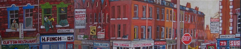
Brick Lane at the junction with Hanbury St.

At the rear of the Nicholls & Clarke building, Norton Folgate.

Leatherworkers at Hyfact Ltd, Links Yard, Spelman St.

Sunday in the Spitalfields Market, Christmas

B2B Building, Osborn St.

Sunrise wedding services, Hanbury St.

Paul Gardner, Gardners Market Sundriesmen, Commercial St.

Phil at Crown & Leek joinery, Deal St.

KTP Printing, Princelet St.

Night in the kitchen at the Beigel Bake, looking out towards Brick Lane.

Big John Carter playing Boogie Woogie on Brick Lane.

Saffire furniture shop, Redchurch St.

Columbia Road Flower Market.

Eugene at North Eastern Motors, Three Colts Lane.

Junction of Middlesex St and Wentworth St, viewed from Petticoat Towers.

Bishopsgate Goods Yard with Spitalfields and the City beyond, viewed from pool deck at Shoreditch House.
Drawings copyright © Lucinda Rogers
Alice Pattullo, Illustrator & Printmaker
Come and see Alice Pattullo’s prints at The Artists of Spitalfields Life opening at Ben Pentreath Ltd on Wednesday 7th November.

Alice Pattullo only moved to London at the beginning of this year, coming – like so many other young artists before her – to make her way in the world. And when I visited Alice in the shared house in Leyton in which she lives, I discovered that one room serves both as her studio and her living space – where she works seven days a week, creating a prolific output of lively and distinctive graphics.
“I had a plan,” Alice explained, her eyes lighting up in excitement, “One, find a house to live in. Two, do what I wanted to do.” Fortunately, a monthly commission from Coast magazine and regular work for English Folk Song & Dance Society publications covers Alice’s rent and gives her the basis upon which to create her own personal work, alongside a steady flow of other illustration jobs. “I can’t really stop,” she admitted to me, “you are working on one thing and it always leads to another thing. There is no distinction between my life and work. It could be really hard to motivate yourself in this situation but, because there’s so many things I want to do, that keeps me going.”
Originally from Newcastle, Alice graduated from Brighton College of Art in 2010 with a first class degree and an enthusiastic no-nonsense attitude. Her small room is lined with a colourful array of the work of twentieth century illustrators she admires and that she has found in markets and sales. Her desk is piled with her sketchbooks which she fills with designs and motifs that she scans into her computer where she reassembles and manipulates them into finished compositions. Impressively, Alice seems equally comfortable with the act of drawing as with digital creation.
I first became aware of Alice’s illustrations when I saw the beautiful print she had created inspired by my story about Steve Brooker, the mudlark, and the confidence and witty ingenuity of her style was immediately apparent. “All my work for the past few years has been about superstitions, folklore, traditions and customs.” Alice told me, “and since being in London I’ve been doing more stuff to do with being here.” Alice showed me two richly coloured prints that she has made as the beginning of a projected series illustrating all the livery companies of the City of London. “It’s about the celebration of a craft,” Alice declared, choosing the Worshipful Company of Glovemakers and the Worshipful Company of Basketmakers to start, as companies that are still involved in their respective trades. “It’s quite a good way to make a little money, and you’re not waiting for someone to give you a job,” she outlined, speaking modestly of these handsome prints that she produces in small editions at low prices to keep them moving.
There is a spirited quality to all of Alice’s work that I find irresistibly appealing. And I admire the way she has adopted her own subject matter and created her own momentum, thereby attracting commissions to keep herself going. Alice has no regrets about moving to London.“It’s been a good decision, I’ve already got so much more work,” she confirmed for me, breaking into a delighted smile.

The Worshipful Company of Glovers

The Worshipful Company of Basketmakers (with the figures of the giants Gog & Magog)

Pearly King & Queen

The Harvest Festival of the Sea

Swan Upping commissioned by the Shopfloor Project

Glandford Shell Museum

Cats at Brighton Museum

Alphabet of Superstitions

A IS FOR ALLAN APPLE. If a girl sleeps with an Allan apple under her pillow over Halloween she will dream of her future husband. If you eat one on Halloween you will be very fortunate in the year to come.

B IS FOR BEES. Bees are seen as sacred as they were thought to be divine messengers and foretellers of the future.You should never kill a bee, and you should always tell the bees of any change in circumstance in the home otherwise they will pine and die, or fly away – a grave misfortune.

C IS FOR CIGARETTE. You should never light three cigarettes from a single match otherwise misfortune will fall upon he who holds the third.

D IS FOR DOGS. Gabriel’s hounds are a pack of spectral dogs that haunt the skies.Anyone who hears or sees the hounds is doomed to s premature death.

E IS FOR EVIL EYE .He who bears the evil eye can bring illness and misfortune to humans and animals alike and can even destroy inanimate objects simply by looking at them.


G IS FOR GLOVES. If you drop your gloves you should always allow someone else to pick them up for you otherwise bad luck will follow.And if they are returned to you then you can expect a pleasant surprise.

H IS FOR HORSE SHOE. The common horseshoe is the best known lucky amulet. However it will only bring you it’s lucky properties if it is hung with it’s prongs pointing up. If the point down all the good luck will fall out.

I IS FOR ITCHING. Having an unexplained sensation in the body, for example an itch is suggested to have a significance depending on where it is.An itch in your: Right ear =Your mother is thinking of you. Left ear =Your lover is thinking of you. Eyes = A pleasant surprise if it is your right, a disappointment if it is your left. Cheeks = Someone is talking about you. Hands = Your right means you will be getting money soon, your left means you will be losing some. Nose = You will be kissed, cursed, vexed or shake hands with a fool!

J IS FOR JACKDAW. Rain is foretold if you see jackdaws fluttering round the top of a building and it is an omen of death if one should fly down the chimney.

K IS FOR KNIFE. To give a knife as a present will ‘cut’ the friendship.This can be counteracted though if the receiver gives something back in return – as though ‘buying’ the knife.

L IS FOR LADDER. A well known superstition is that it is unlucky to walk under a ladder but the bad fortune comes as the shape the ladder makes from leaning against a wall is the triangle of the Holy Trinity and walking through it suggests a sympathy for the Devil!

M IS FOR MERRYBONE. If two people hold each end of the forked bone found between the breast and neck of a fowl and break it while forming a secret wish, he who gets the larger half can be assured his wish will come true.

N IS FOR NAILS. Cutting your nails at sea will provoke a storm. If a young unmarried woman cuts the nails on her right hand she will rule her husband.A child’s nails should never be cut or he will become ‘light fingered’ but can be nibbled off by his mother.

O IS FOR ONION. Snakes have an aversion to onions so to protect against their attacks it is wise to carry a raw onion in the hand.

P IS FOR PINS. See a pin and pick it up all day long you will have good luck.

Q IS FOR QUELLING. To quell the waves in a storm it is suggested that you throw a pack of playing cards directly into the waves.

R IS FOR RAVEN. To see one raven is lucky, tis’ true, but it’s certain misfortune to light upon two and meeting with three is the Devil.

S IS FOR SCISSORS. Like giving a knife as a present, scissors too will cut the friendship.To drop a pair of scissors is thought to be unlucky and if they fall with the points facing downwards there will be a death shortly in the house.

T IS FOR TATTOOS. A sailor without tattoos is like a ship without grog. Not seaworthy.

U IS FOR UMBRELLA. You shouldn’t open an umbrella indoors otherwise it will bring misfortune to the whole household.

V IS FOR VULTURE. Vultures are birds of ill omen as it thought the can predict death and have an unsettling diet of corpses.

W IS FOR WOOD. Touching wood is thought to be an action that will help counteract the threat of evil. It is usually done when someone is thought to have tempted fate.

X IS KISSING. An unexpected kiss from a tall dark stranger is certain to be followed by a proposal of marriage. But beware! Kissing a man with a moustache should not be lightly undertaken – if a hair attaches to your lips you will never get married!

Y IS FOR YELLOW HAMMER. The yellowhammer is considered an ill omened bird as it is egg is covered in serpent like marks associating it with the Devil.

Z IS FOR ZODIAC. Each ‘house’ in the zodiac has it’s own unique character and people born within the dates are supposed to share similar traits.

Alice Pattullo in her room in Leyton.
Illustrations copyright © Alice Pattullo
Joanna Moore, Artist
Come and see Joanna Moore’s drawings at The Artists of Spitalfields Life opening at Ben Pentreath Ltd on Wednesday 7th November.

When I arrived to meet Joanna Moore at the end of an afternoon’s drawing in Christ Church, Spitalfields, a small crowd had gathered to peer over her shoulder at her work. As you can see from the photo above, it is an interior that presents a considerable challenge to an artist. I would not choose to sit down with a pen and paper and try to draw it, but this was precisely what Joanna had done. It was her first attempt and, in a single session lasting just a couple of hours, she succeeded with such style that as the drawing approached completion, people stopped to marvel at her facility with lines.
I took Joanna to the Market Coffee House afterwards, to celebrate her remarkable afternoon’s work, of which she appeared modestly unaware. In the Coffee House she opened a portfolio to show me her other drawings of Spitalfields. A couple of years ago, Joanna came to live in an old house in Hanbury St for a couple of months and while she was here, something extraordinary happened, she discovered a compulsion to draw. “Life started changing and I went part-time in my job because I needed to see how well I could draw. I realised that if I didn’t do it now, I’d never do it. And this coincided with moving to Spitalfields – I found it so inspiring here.” explained Joanna, recalling that harsh Winter which proved such a cathartic and creative time in her life.
As Joanna produced an array of the fine drawings from her portfolio which record her time here, she spoke of the excitement of the circumstances from which they arose. “It was lonely living here in this beautiful old house, but I was determined to draw – separated from the people around me, I didn’t know anyone, I was just renting a basement. I bought myself fingerless gloves to work outside, but it was so cold I could only do an hour’s drawing at a time. You can deal with the cold in your head and body, though when your hands get cold, then you can’t control your fingers to draw anymore.”
It was apparent from these fluent drawings that Joanna’s achievement was far greater than simply retaining control of her fingers but, more than this, I was inspired by the personal discovery these works manifested. The nest of lines within these quiet yet sophisticated drawings trace the birth of a vibrant talent. Within the pluralism of contemporary art, there is a resurgence of drawing and a recognition that a talent and facility for draughtsmanship – which Joanna found within herself – is not to be under-rated. In architectural drawing, most people struggle to get their lines in the right place when attempting to record structures, but for Joanna this is second nature. She can do it with ease, and brings wit and humanity along too.
Joanna never set out to draw, she trained as an architect yet became alienated at the idea of life in front of a computer terminal, switching to Art History in the middle of her studies. Since leaving Cambridge five years ago, Joanna worked as an architectural historian but found herself increasingly fascinated with looking at the buildings she was working on. Then, at twenty-five years old, Joanna discovered what she wanted to do, embarked on a year’s course at the Prince’s Drawing School in Shoreditch and now works as a freelance illustrator.
“The more I draw, the faster I get and the freer I get,” admitted Joanna, her eyes gleaming with determination and passion for her chosen course. “It’s a very pure pleasure,” she continued with a gentle smile, considering her portfolio and aspiring to find words for the dynamic experience of drawing,”That’s why I’m driven, because it’s the purest art form you can get – to record what’s in front of you. I don’t want to use my drawings as the basis for paintings because I’m more interested in drawing the next thing.”
Too few people follow their enthusiasms, and so I was inspired to meet Joanna Moore at this crucial moment in her life.

Princelet St

Trinity Green Almshouses, Whitechapel
 The Brick Lane Beigel Bakery

At the Tower of London

Christ Church, Spitalfields
Drawings copyright © Joanna Moore
You may also like to read about
Joanna Moore & The Spitalfields Nobody Knows
Marianna Kennedy, Designer
Come and see Marianna Kennedy’s lamps and mirrors at The Artists of Spitalfields Life opening at Ben Pentreath Ltd on Wednesday 7th November.

Behind this enigmatic facade – lettered W&A Jones – at 3 Fournier St, directly across from Christ Church Spitalfields is the showroom, workshop and home of designer Marianna Kennedy. You can even see Nicholas Hawksmoor’s spire reflected in the crown glass panes of her shopfront.
For years, I have walked past this place and wondered what goes on here, so I was very excited to go inside and meet Marianna in person. Entering through the door on the right, I found myself in a bare eighteenth century hallway, where I was greeted by a woman dressed in elegant charcoal tones who spoke with a soft Canadian accent. Marianna invited me upstairs and I followed in her footsteps until we arrived in her beautifully proportioned panelled living room. As I craned in wonder at the window, looking down onto Fournier St and raising my eyes to the steeple towering overhead, Marianna busied herself screwing up newspaper with professional aplomb. She was lighting a fire in my honour, so we could enjoy a fireside chat.
Observing my curiosity, Marianna offered me a tour of the house and then, with a playful levity, she was off again, vanishing from the room like the White Rabbit. I followed her up more stairs, round and round, with each storey offering a new perspective backwards into all the secret gardens and yards that comprise the spaces between these ancient houses in the shadow of the church. There are so many of these wonderfully irregular old staircases in Spitalfields, each with their own creaking language and each leading to surprises. At the top of this one, we turned sharply and ascended a final narrow flight, barely two feet wide, to pass through a door and arrive on the roof where, hidden behind the parapet, Marianna has created an astounding secret garden with a wildflower meadow. The rooftop is on a level with the bell tower of the steeple across the road, and Marianna stood patiently in the frosty meadow with all the mysterious poise of a heroine in a Wilkie Collins novel – while I gazed across the rooftops of Spitalfields, admiring the ramshackle irregularity of the old tiled roofs and chimney pots.
Once we were back by the fireside, Marianna settled into a wing chair illuminated by the morning sunshine and became eloquent in her affection for the architecture of the old houses here. She explained that she first came to stay in Fournier St twenty-five years ago while a student at the Slade. Marianna and her husband renovated 42 Brushfield St (the house with the sign “A. Gold, French Milliners”) before taking on the current property in a derelict state, prior to their repairs, ten years ago. Working with the Spitalfields Trust over all this time, Marianna has developed a sympathetic instinct for the decor of these wonderful spaces through the subtle use of traditional paint colours for panelling and old floors. “It is all about lack of ego, restraint and humanity,” she admitted to me. “You can make something look so natural, like it has always been there,” she explained, before adding significantly “- that is a very hard thing to do.” Certainly, Marianna’s home confirms this aesthetic, a working house with elegant functional spaces which serves as the ideal showplace for her furniture designs.
Above the fireplace in her living room is a huge bronze foliate mirror with tinted mercury glass to Marianna’s design, here in a corner is a lacquerwork table with cast bronze legs, hanging against the stairwell window is a dazzling collection of colourful transparent resin casts of plasterwork details and in each room there are the lamps of traditional design, also cast in brightly coloured resin – these are her signature pieces. All these artefacts are unmistakeably contemporary and yet, because they are made by craftsmen using techniques that have been around for centuries, they compliment the interior of the old house.
As we made our way down to the shop to say goodbye, I congratulated Marianna on recreating such a beautiful house. “It still has its magic,” she said with understatement, and, after my experience that day, I can happily confirm her assertion.


Marianna Kennedy
Portrait copyright © Lucinda Douglas Menzies
You may also like to read about


