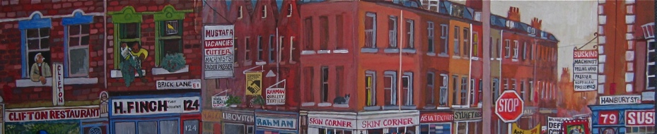
Signs, Poster, Typography & Graphics
Bookings for THE GENTLE AUTHOR’S TOURS are now open for June & July

E2, 1962
“It could almost be a metaphor of the East End, parts of it were hanging in tatters but it was a beautiful tapestry of things that had been,” said photographer John Claridge, talking fondly of this picture of posters peeling from a door from 1962. One of a set of photos of signs, posters, typography and graphics that John took in the East End during the sixties when he was in his teens and twenties.
At fifteen years old, John went to work in advertising at McCann Erickson where he encountered the inspiring figure of designer Robert Brownjohn, who had once been a pupil of Moholy-Nagy and famously created the opening credits for ‘Goldfinger’ and ‘From Russia With Love.’ “It opened up my eyes to how people communicate and the beauty of typography.” John confided, “You’re surrounded by it and you’re brought up with it, but people like Robert Brownjohn take it to another level.”
Today, John describes these photographs as coming from ‘the time when my eyes were opened,’ yet he admits he was ‘always interested in what’s not intentional,’ and these pictures all delight in the incidental visual humour and poetry of the human condition – whether a former chapel selling light bulbs that offered ‘batteries recharged,’ or a damaged poster for the mass X-Ray of 1966 that resembled a pair of lungs. “I’m still excited by them,” he confessed to me, “My work in advertising was about solving other people’s problems, but these pictures are the outcome of personal feelings.”
“People used to ask me why are you photographing that?” recalled John in amusement. Eastenders have always had the knack of communication, and it was John’s gift to see the beauty in the urban landscape through the marks made by those personalities that created it.

E1, 1964.

E1, 1961.

E 14, 1966. “The poster looks like a pair of lungs.”

E9, 1964.

E1, 1969. “Bertrand Russell looking at the end of the world – the window is like a mushroom cloud.”

E13, 1959. “I used to go with my mum to Queens Rd Market on Saturday morning to get a few bits and pieces.”

E1, 1968. “My mum and dad read the Stratford Express.”

E1, 1967. “There were quite a few of these around.”

E15, 1962. “The Two Puddings was a brilliant pub.”

E14, 1970. “It reminded me of ‘Soylent Green’, the science fiction movie with Edward G. Robinson.”

E7, 1966.

E1, 1964. “The corrugated iron looks like it’s melting, or like a painting of corrugated iron.”

E1, 1967.

E2, 1963.

E2, 1965. “This lettering is not professional, but very human.”

E13, 1960. “Like stepping onto a stage.”

E7, 1968.

Cable St E1, 1962.

E1, 1964. “Boys used to say ‘No rubbish here,’ when they were selling in the street.”
Photographs copyright © John Claridge
You may also like to take a look at


THAT is interesting. John Claridge observes things in a similar way to me. And typography also inspires me a lot. — My connection to the BAUHAUS was similar: my design professor had been Wilhelm Wagenfeld’s studio manager for a while. Wagenfeld studied at the BAUHAUS and is known for his famous Bauhaus lamp WG 24.
The poster for the mass X-ray is indeed reminiscent of the “mass vaccinations” of today…
By the way: the film “Soylent Green” is titled “Year 2022 — who want to survive” in Germany. I saw it in the cinema in the 70s. If I had known back then what would actually happen in 2022…
Love & Peace
ACHIM
From the department of obsolete knowledge…
Atlas the electrical shop: a generation or two earlier than 1964 people had battery powered radios that used thermionic valves (‘vacuum tubes’ in American). Valves needed a filament current to make electrons and a high tension (HT) supply to actually power the amplification and oscillation circuits. HT for battery radios was something like 90 volts or as high as 140 volts.
A high tension battery was made of dry cells stacked together like the PP3 and PP9 batteries you can still buy now, but gave 90 volts instead of 9 volts. These were used once and then discarded.
The filament battery could be a rechargeable lead-acid accumulator, usually 2 volts. You took those to a local radio shop or garage for a recharge now and again. Of course, regular trips to get the accumulator recharged provided the shop owner with a selling opportunity.
Large household battery radios that had rechargeable accumulators accwent out of use from 1940s onwards so this could be a really old sign. Portable battery radios which used 1.4 volt dry cells (not rechargeable) clung on until the ubiquitous transistor radio became available.
My point in retelling this useless knowledge here on your blog is that *each image* in Mr Claridge’s collection probably has similar layers of meaning and knowledge attached, which we are in danger of losing.
PS: Mr Claridge’s images with their compact and well-defined grain and high contrast always suggest Agfa Rodinol developer in a fairly stiff concentration to me.
I worked as a copywriter for some time and love all things to do with typography and fonts; I also collect books on the subject.
Achim’s reference to the BAUHAUS is interesting – after I moved to Switzerland the first major exhibition I went to see was about this movement at Vitra Design in Weil Am Rhein, Germany. I saw an original of the lamp he mentions here and often return there (it’s my favourite Design museum, a short hop across the border by tram).
A great post!
Very evocative. Thank you. Reminds me of a sign I sawa few miles from where I live:
Written by hand in capitals:
THIS IS NOT AN OLD PROS HOUSE. DO NOT BSNG ON THE DOOR.
The woman’s daughter aged 15 if standing oitside her door or nearby was accosted many times.
As a collage artist (and former graphic designer/illustrator) I so enjoyed this visual banquet by Claridge. To me, this series is about mark-making. How man makes a mark. How the passage of time makes a mark. How a random board, tacked on top of another board, will make a collective mark. How an accidental placement will create something brilliant. Marks are made through accumulation (top image – amazing!) and yet other marks are made when something decays and falls away. I love the rune-like scratchings, vintage fonts hanging in tatters, backwards-reading signage reflected in glass, a chubby paint brush dipped in white paint, and the double “CLOSED” signs. (perhaps the beginning of a collection?)
Divine imperfection. I never tire of John Claridge photos — Please keep ’em coming.
The penultimate photos show what remained of a Passmore Edwards building. During my two years study at the Borough Poly, never once did I see the Borough Road Library, but discovered it years later when visiting the site of the London South Bank University. That led to a search to find out more about Passmore Edwards.
The Gentle Authors blog is superior to what I discovered: https://spitalfieldslife.com/2016/04/04/passmore-edwards-libraries-in-the-east-end/
A reminder that such men are founders of our good way of life now.