John Claridge’s Signs, Type & Graphics
On 2nd June, I am publishing the definitive collection of over two hundred photographs of John Claridge’s EAST END. Please email spitalfieldslife@gmail.com if you are willing to invest £1000 to help me publish this important book and I will send you further information. You can also support publication by clicking here to pre-order a signed copy for £25.

E2, 1962
“It could almost be a metaphor of the East End, parts of it were hanging in tatters but it was a beautiful tapestry of things that had been,” said photographer John Claridge, talking fondly of this picture of a posters peeling from a door from 1962. One of a set of photos of signs, posters, typography and graphics that John took in the East End during the sixties when he was in his teens and twenties.
At fifteen years old, John went to work in advertising at McCann Erickson where he encountered the inspiring figure of designer Robert Brownjohn, who had once been a pupil of Moholy-Nagy and famously created the opening credits for ‘Goldfinger’ and ‘From Russia With Love.’ “It opened up my eyes to how people communicate and the beauty of typography.” John confided, “You’re surrounded by it and you’re brought up with it, but people like Robert Brownjohn take it to another level.”
Today, John describes these photographs as coming from ‘the time when my eyes were opened,’ yet he admits he was ‘always interested in what’s not intentional,’ and these pictures all delight in the incidental visual humour and poetry of the human condition – whether a former chapel selling light bulbs that offered ‘batteries recharged,’ or a damaged poster for the mass X-Ray of 1966 that resembled a pair of lungs. “I’m still excited by them,” he confessed to me, “My work in advertising was about solving other people’s problems, but these pictures are the outcome of personal feelings.”
“People used to ask me why are you photographing that?” recalled John in amusement. Eastenders have always had the knack of communication, and it was John’s gift to see the beauty in the urban landscape through the marks made by those personalities that created it.

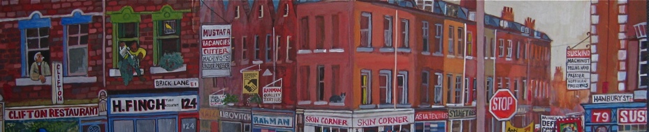
E1, 1964.

E1, 1961.

E 14, 1966. “The poster looks like a pair of lungs.”

E9, 1964.

E1, 1969. “Bertrand Russell looking at the end of the world – the window is like a mushroom cloud.”

E13, 1959. “I used to go with my mum to Queens Rd Market on Saturday morning to get a few bits and pieces.”

E1, 1968. “My mum and dad read the Stratford Express.”

E1, 1967. “There were quite a few of these around.”

E15, 1962. “The Two Puddings was a brilliant pub.”

E14, 1970. “It reminded me of ‘Soylent Green’, the science fiction movie with Edward G. Robinson.”

E7, 1966.

E1, 1964. “The corrugated iron looks like it’s melting, or like a painting of corrugated iron.”

E1, 1967.

E2, 1963.

E2, 1965. “This lettering is not professional, but very human.”

E13, 1960. “Like stepping onto a stage.”

E7, 1968.

Cable St E1, 1962.

E1, 1964. “Boys used to say ‘No rubbish here,’ when they were selling in the street.”
Photographs copyright © John Claridge
You may also like to take a look at


What an eye !
John Claridge stands with Brassai and Robert Doisneau .
Wonderful!
I can see exactly why John took all of these, they are wonderful, and I share his love of typography so they really appeal to me. This, as I said before, is art, and the typography takes me back to my Art School days and the way that we were taught by the late John O’Connor, known to us as JO’C. More congratulations John.