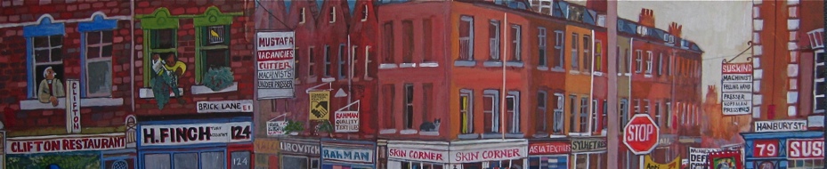
More of Jim Howett's shop fronts

This photograph shows numbers one and three Fournier St – a detail of a plate of Christ Church, Spitalfields in a book of old London churches from 1896. As well as being a unique historical record this picture also includes a pitiful old nag outside number three, a hidden realistic incidental detail revealed by the enlargement, at odds with the photographer’s picturesque ambition to illustrate the nobility of our capital’s churches. A century later, this photograph was confirmation that although both premises pictured were empty and neglected after the fruit and vegetable market moved out (an ex-banana importer and an ex-pawnbroker’s premises respectively), the shop fronts were largely unaltered. In fact, both these frontages were themselves alterations, dating from when these eighteenth century houses became shops in the eighteen forties. A consideration that emphasises the continuum of change, while revealing the dilemmas raised by any pursuit of authenticity in Spitalfields.
In 1998, when Jim Howett set about the restoration of number three Fournier St, apart from replacing the doors and opening up the lights to the cellar below, the work entailed repairing what remained. Using a palette knife, through painstaking work, it was possible to pick the paint off the fascia to reveal the earlier signwriting, “W & A. Jones.” The following year, Jim was asked to create the shop front for number one, which had been stripped out for use as a warehouse and there he designed a shop frontage that continued the same structure and style of number three. This discreet work has restored the modest dignity to this pair of houses at the foot of Fournier St, linking Fournier St with the market, and quietly complementing the baroque egoism of Nicholas Hawksmoor’s Christ Church.
Directly round the corner at 86 Commercial St, directly on the other side of the Ten Bells public house which occupies the corner site, Jim had the opportunity in 2004 to design a new frontage for “Beedell Coram” (Andrew Coram’s antique shop) and thereby define the look of this corner which is a key location at the centre of Spitalfields. Interestingly, the frontage at the time attempted a faux period style, yet the low fascia blocked daylight from the interior of the shop and created a strange disjuncture between the shop front and the building above, which only served to emphasise the fakeness of the design. Structurally, what revealed this as a modern shop front was the door cases, which were set on a plane with the window. In the past, door cases were usually set back, allowing people to step in from the rain while opening or closing the door – creating an intermediary space that modern developers seek to avoid, as a potential location for homeless people to shelter.
Working from a photo of the earlier shop front, taken in the nineteen sixties when the premises were Donovan Bros Market Sundriesmen, Jim reconfigured pieces of the current frontage. Setting back the door cases immediately restored the proportion, while raising the fascia reconnected the frontage to the top of the building and allowed more light into the shop too. While addressing these formal considerations, Jim equally considered the function of the space. He reinstated the cellar lights, which allow the basement to become a business premises and installed a metal grille (recycled from the former pawn shop at 11 Princelet St) which better serves an antique dealer than shutters, providing security and permitting window shoppers to peer through the glass at night. Finally, in contrast to the anachronistic Gill Kayo typeface used for “Flowerworks”, Jim took the style of sans-serif relief lettering for the new sign from the lost fascia of an old Jewish delicatessen in Brick Lane, that he photographed when it was briefly uncovered.
The finished result is in revealing contrast to the heritage style design that preceded it, Jim’s shop front looks natural because it was created from an understanding of form and function, based upon a conscientious research of the historical record. There is an austere dignity in this work that is never ostentatious, drawing attention to the contents rather than foregounding the design of the fascia, and now this shop complements the streetscape that surrounds it, becoming part of the larger picture rather than jostling for attention with the neighbours.
When you arrive in Spitalfields from Liverpool St Station, walking up Brushfield St towards the church, you notice Jim’s shop fronts for Verde & Co and A.Gold on your right, and arriving at Commercial St to stand in the shadow of the spire, you see the Ten Bells to your left flanked by Jim’s shop fronts on either side. The irony of the modest aesthetic apparent in each case is that these are all the shops that look most at home, while the others appear interlopers by contrast. Amidst the jostling contrast of the old and new, it is the work that Jim Howett has done which sews everything together, picking up threads of the past and defining a quiet vernacular style that is unique to Spitalfields, as part of the fabric and the personality of this place.
Read the previous feature here Jim Howett’s Spitalfields shop fronts

Three Fournier St, prior to restoration.

Three Fournier St today.

86 Commercial St in the nineteen sixties.

86 Commercial St in the nineteen nineties

86 Commercial St today

The fascia uncovered on Brick Lane that inspired the Beedell Coram lettering

At the corner of Commercial St and Fournier St, the Ten Bells, flanked by Jim Howett’s shopfronts.


Wow. I’ve always thought these restorations were brilliant, but seeing the shops in photos like this makes me even more in awe of them. The nineties picture is especially interesting: whoever did that was heading in the right direction, but Jim Howett’s job is just so infinitely superior. It’s partly the fonts and the little details – the railings, the grilles and so on – but you’re right, it’s mostly about getting the proportions right. Fantastic stuff.
We’ve been buying our Camden Lock Books printed paper bags from Donovans for about 12 years. I’m placing a new order this week for another 10,000 brown paper bags. They are walking distance from us at Old Street Station. Local enterprises keeping business local.